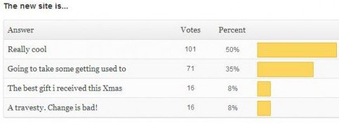
Before we get to the new poll, here are the results of the last (and first on the new site) poll.

Dead even when it came to the highest praise and the most violent rejection of the new site, but happy to see that more than half of you are happy with the new surroundings and those less sure are willing to give it some time.
Today’s new poll is already a bit of a mess up because I couldn’t get the images to load with the poll. Will try and get that working tomorrow, but scroll down a little and you’ll clearly see the two photos we’re asking about.


137 days ago by kuyaglen
I dont like navigation bars on the right.
137 days ago by omgzrachel
The B&W photo is nice, but forgettable. The print ad gets my vote.
137 days ago by LH458
I sit in front of a 23′ TFT and i have not the best eyes but the whole Site its to heavy. Make the whole font size maybe 10 percent less like the Site before and it could help. I don’t no .. everyone likes different
136 days ago by Stefan
I sit in font f a 22″ TFT and everything looks perfekt!
Maybe you should take a higher resolution like 1920 x 1200
137 days ago by LH458
EDIT: its like u reading a .pdf with to much zoom……..
136 days ago by jesslv74
It looks fine to me, on both 22″ and 24″ monitors. It is quite a bit bigger than the old layout but I’m not having any trouble navigating around. Is it just the size that’s a problem or are things cut off? Maybe you’re just having a hard time adjusting.
136 days ago by Kris
Could you be more specific? If you mean the main menu (Home, Calendar, Films, Image Gallery etc) then it’s always been to the right, so that’s no different than before?